Friday, 2 May 2014


Question 3
I recorded Cath Shanks (19) and Lizzie Finley (18) discussing my music video and ancillary texts after they watched and looked at them this is the feedback I got.
I also created a feedback sheet with these questions on-:
Are You
Female/Male?
How Old
Are?
What
genre do you think my video is?
What do
you like about it?
What do
you think I can improve on?
Any
additional comments?
And I asked these in lessons.
Furthermore I got feedback from my sister (aged 23) who was just out of my target audience however a fan of P!nk's music and she thought the music video conformed to Pop and thought it reflected the lyrics in the song and she would buy the song from watching the music video. She also said that the ancillary texts linked with the music video and conformed to the conventions of Pop.
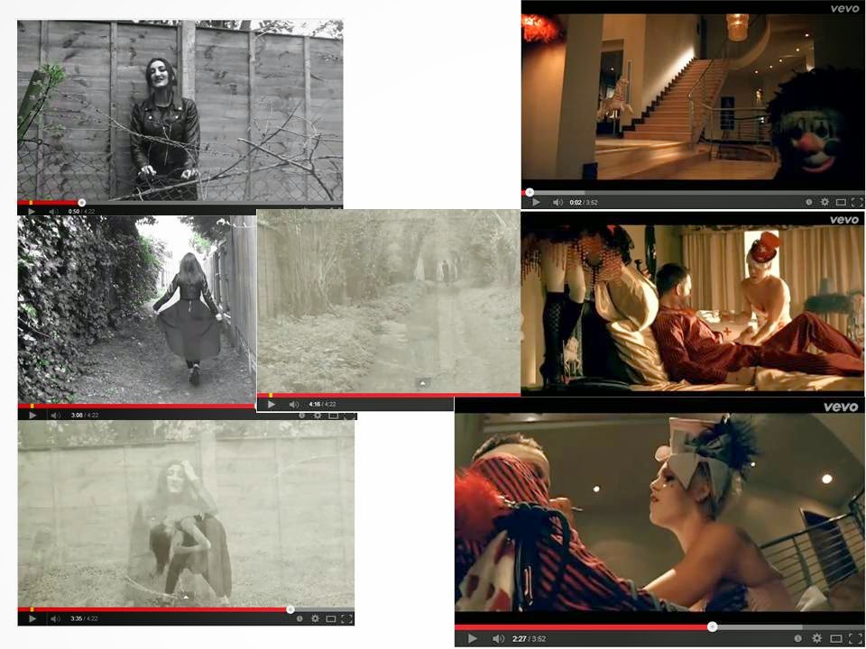
From my audience feedback I have learnt that my music video and ancillary texts where successful in conforming to Pop, selling a song and being entertaining. I know that if I were to do it again my biggest improvement would be on the lip - syncing issues, I found that sometimes I couldn't get the timing right with the lip syncing and the lyrics because it was that my artist had not held the note on for long enough or for too long because in the same shot the lyrics would later on match with the lip syncing therefore I would improve this by paying attention to detail when my artist learnt the song and helped her learn the timings correctly.
I have also learnt that my audience enjoyed the use of filters which I created when editing and they thought it added to the concept of being on a journey and coming out of darkness into the light (the pop green colour) which they thought. The also thought the editing was in time to the beat and was fluid which matched the fluidity of the song. My feedback also showed that my audience thought the costume and location was appropriate to the concept of the song.


Monday, 28 April 2014
Product Placement


Digipak

This is my first complete digipak, I've realised that my track list needs a second disc, list so I will improve on this.
Thursday, 24 April 2014
Posters Drafts and Final Product


Final Product

Although each draft only varies slightly, I chose to not use as much green as I think it clashed with the album cover and didn't look as professional as the black and white with selected words in green. I chose to use green and not the other album covers as it links the poster in with my music video "mean" as you will see the use of pop colour (Green) throughout the video. Therefore the green and the black and white incorporates my music video into the poster. However the style of image such as the blend of the "Ghosts" make sure that the poster is still recognized alongside the album cover.
Tuesday, 8 April 2014
Feedback from Daniel Swift

This is the feedback I got from Daniel Swift, we both analysed each others music videos and told each other what we liked and disliked about each others final drafts.
Final Draft
This is my Final draft, I have fixed the lip syncing which was my main problem and I've exported it in a higher quality so it's not fuzzy. Like my second draft, I'm going to conduct audience feedback to see if it's conventional to the form and genre.
Ancillary CD Drafts

This is my first draft, I like the text and think it convey the pop genre, I think I can make more of the imagery though, and make the front layer more dominant and not as much opacity.

I experimented more with the colour balance, hue and saturation, I also added more layers, by copying the front layer which I had selected and cut out previously and saved as a separate file. I like the fades between the different levels. and I like how the front layer is more dominant.

I placed a dissolve on the back layers, and made the other layers more opaque, as well as experimenting with making it more lighter. However I think I prefer my 2nd draft to this.

I like the different colours I've used in this draft as I think it conveys pop and the purple stands out against the album title "Ghost"
Overall after getting feedback from other peers in the class. I believe draft 2 conveys Pop the most. And this is what I will use in my digipak
Monday, 7 April 2014
Monday, 31 March 2014
2nd Draft
Self Improvements
- Lip syncing
- Needs to be exported in a higher quality.
This is my second draft of my music video, below is the video feedback I conducted after my target audience had watched it.
Sunday, 2 March 2014
Original Images Taken for my Ancillary texts

Test Shot

This is the area, where I took some of the shots, I like the mise en scene of blossom as it contrasted with the costume that my artist wore. I also think by editing this image, I may be able to use it for the CD

Extreme Long Shot of costume

Long shot of costume - I chose the use of a leotard and kimono as it reflects "Laura Mulveys" Theory of The Male Gaze. I chose black clothing and black lipstick to connote the theme of the music video which is a break up. Therefore the black connotes the death of romance/love.

I use the gems around the eyes and glittery eye shadow to convey the pop genre. which is eccentric on costume and stage design.

I dislike this photo due to the lightening.

I like the photo because of the way my artists hair sweeps across her face and how she looks into the distance connoting a lost look.

I don't like this image because some hair has covered the artists face.

I like the lighting in this image, however because my artist has her eyes closed, I'm not sure if I would use this.

I dislike this image because once again her hair has blown into her face.

I wouldn't use this image because I don't think it's an appropriate shot because my artist looks expressionless

I like this image because of the way the lighting is caught and the mise en scene of the background. I also like the voluminous hair of my artist. - I may use this one.

I quite like this image, and how the artists uses the blossom as a prop however I'm quite sure if it conveys more of a heavy metal/alternative genre as the image looks quite haunting and scary because the artist is staring directing into the camera it gives an almost threatening representation .

I like this image.

I quite like this image however a strand of her hair has blown onto her face, so I wouldn't use this

I like how the artist is stood on a side here, I may use this as track cover

I don't like this image as a close mid shot

I don't like this image either due to the shot length.


I wouldn't use this as my artist blinked.

I don't like this image.

I quite like this image because my artist gives of quite a sexy look - conveying pop.

I like this image too.

I'm unsure about this image because her hair has blown in front of my artists face.

I moved further down the track I was on a changed location, to contrast against the nature theme.
As my artist blinked I wouldn't use this image.

This image may work as CD artwork when Photoshopped and maybe blurred with an other

I don't like the lightening in this image

I don't like the lightening in this image either.

I don't like this lighting in this image either

This image has slightly more exposure to the other and I may use this one.

I don't like this image.

I quite like how the light captures this image, however I'm not sure about the long shot.

I think the mid shot is better, however the artists hand looks odd.

I like the mid shot and how the like catches in the corner and brings out the gems on my artists eyes, I may use this.

I don't like this.

I don't like this image either.


I think these two images look to sweet and innocent and doesn't convey the theme I am aiming for.

I don't like the framing of this image

I like this image, however I would have to Photoshop the piece of hair out before using it.

I like this image, even though the hair has blown in her face, I like the angle of the arms and It may work for a album cover or the back of the album.

I like the windswept look in this image

I also like the lighting and windswept look in this image

I quite like this image, I may use it for the poster.

I don't like the angle in this image

I quite like this image and may use it for the inside of the digipak

I think this image is quite boring


I like this image, although it would need rotating

I also like the way the artist has posed in this image

I don't like the pole in this image

I may use this image for the poster
Subscribe to:
Comments (Atom)